Archive for the ‘Uncategorized’ Category
Well this is pretty cool. As many of you may know Michael Graves products moved from Target Stores to JC Penney back in 2013. This was part of then CEO Ron Johnson’s efforts to bring in younger / more affluent consumers. The articles I have read note that many of these design mini stores have been out performing the more traditional areas of the store. I was excited to see what my buddies at Graves could do with the slightly higher price point of a department store to work with and they did not disappoint. In addition to a lot of cool new items, they ended up launching a few products that I designed about 10 years ago when I was a staff designer there at Michael Graves Design Group in New Jersey. This is stuff that I never thought would see the light of day but also had always been really proud of, so seeing it at the store for the first time was super fun.
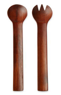
Michael Graves “Celery” Salad Servers circa 2013
Besides designing some of the newly launched items, I actually came up with the design language that appears in a number of other items as well. Take a look at the salad servers shown here. If it’s not obvious from the image, our internal nickname for the handle shape was “celery” as it has a U shaped cross section. We were asked to combine Graves with Scandinavian and this was my take on that directive. These salad servers first appeared in the Dansk collection back in the day in a maple finish and here we can see them in a darker finish. These came out pretty much exactly like my original sketch, which was pretty exciting to a young designer me just out of school. We did a million versions of everything and the work was very collaborative so if your design language had enough “stickiness” to make it through development and onto shelves it was a pretty good feeling. In this very delayed case it feels a lot like running into an old friend at a reunion and finding that life is treating you both pretty well.
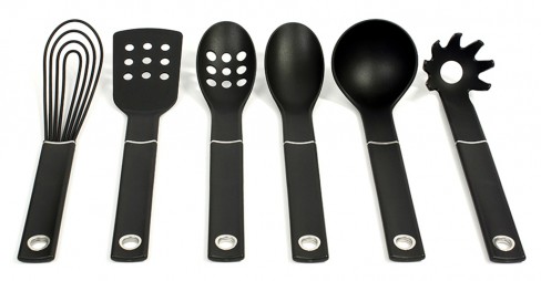
Michael Graves “Celery” Kitchen Tools circa 2013
So management, and of course Michael, liked the “celery” design language enough that we were asked to create a whole line of kitchen tools in this vein. My manager at the time, the extremely talented Yuka Midorikawa headed up the project and along with my buddy Andrew March, we designed and developed the “celery” line of kitchen tools. Montage: A lot of sushi was consumed at late hours, Flaming Lips and Outkast was played, very precise line drawings were created along with beautiful CAD models and renderings, the client loves it, sadly it does not make it to the stores because the samples were not up to par, I move to Philadelphia to live closer to my future wife, we move to NYC, we move to Birmingham, I see Kevin Nealon on the street while traveling but I don’t say anything because I think celebrities deserve their privacy, I notice one morning that my sideburns are starting to go grey, and then finally the “celery” kitchen tools launch at JC Penney in 2013, fade to black. Other teams at the time adopted the “celery” design language too. There was Graves silverware (Curv.E flatware), mixing bowls and for the 2013 / 2014 collection for JC Penney they came up with a few more designs using “celery” including an ice bucket and bottle opener.
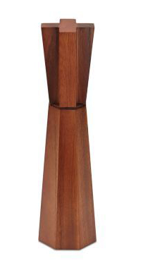
Michael Graves “Cruciform” pepper mill circa 2013
Another old favorite of mine was the “cruciform” Peppermill. Originally designed to be made in ebonized maple as shown in the 2004 Book Michael Graves Designs: The Art of the Everyday Object, the JC Penney version circa 2014 has a teak like finish that I think works really well. I was looking at teak mills of the 60s from Dansk and Scandinavian companies and this was really an homage to mills of that period with more contemporary proportions.
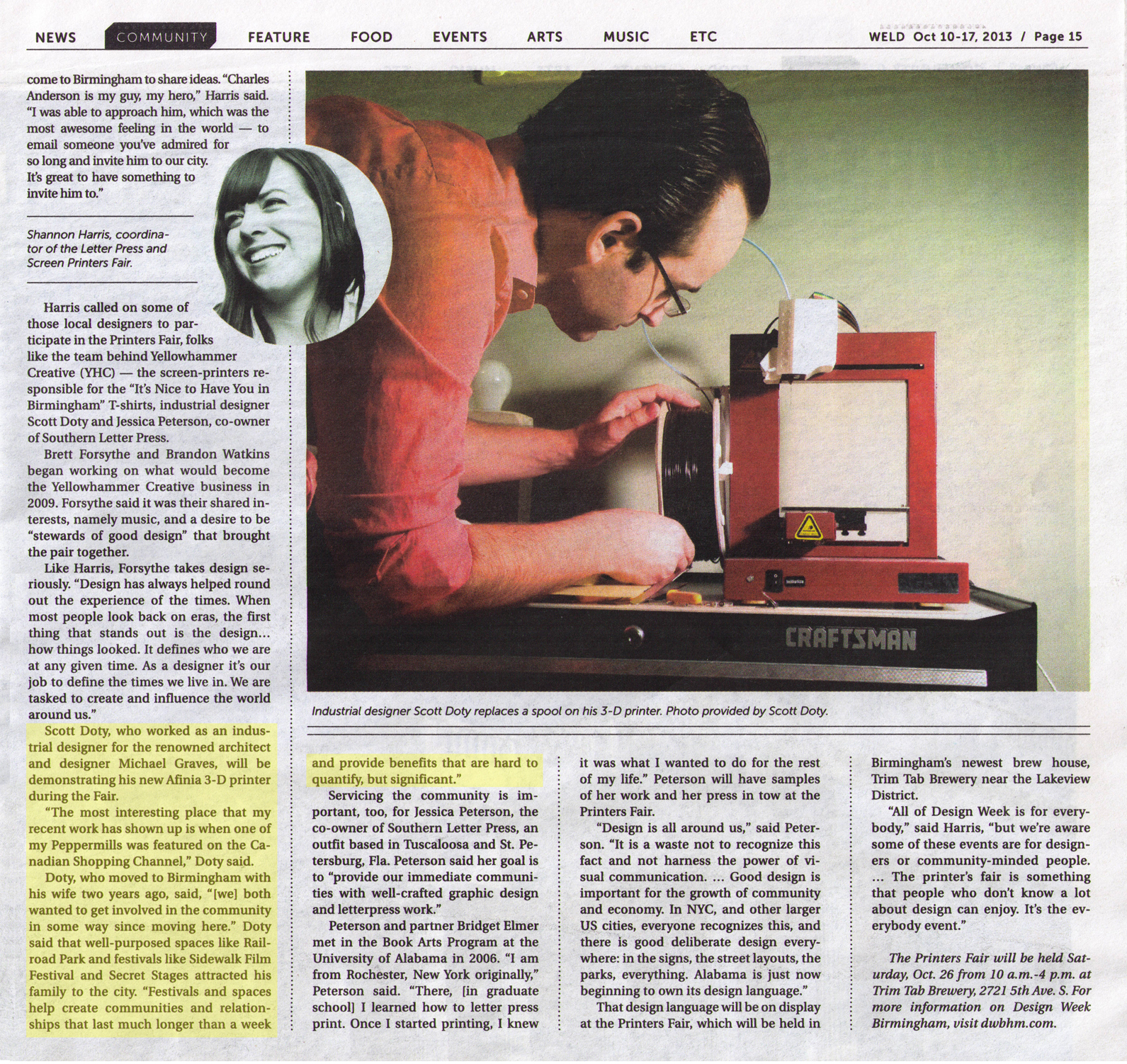
I recently participated in the Printers Fair as part of Design Week Birmingham, 2013. Situated inside Trim Tab’s new brewing space, this was a great event. The 2D printing talent in Birmingham and the region is quite impressive. Many who came by were seeing a working 3D printer for the first time. I demoed my version 1.0 Afinia H 3D printer and answered questions about architectural, product design, ceramics, and traditional 2D printing uses.
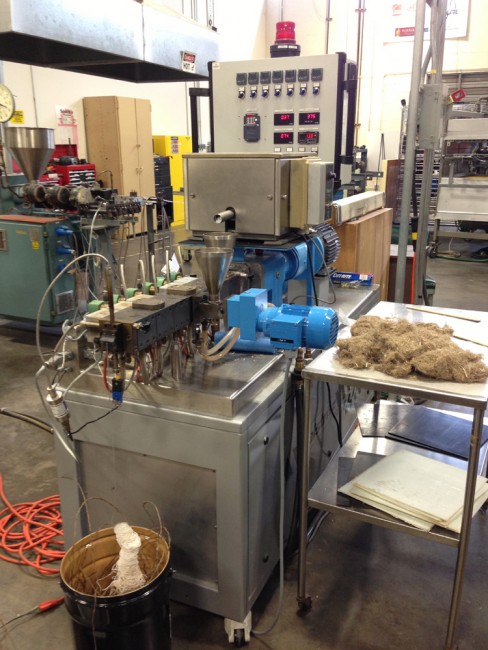
This machine mixes resin with fiber and chops it up to prep it for the compression molder

Natural composite consisting of banana fiber with partially recycled plastic
In the other lectures throughout the day a variety of other aspects about the recycling of composites were discussed including the importance of labeling and separating for ease of recycling, the challenges of chopping up old fighter jets into chopped carbon fiber, and the future of recycling asphalt roofing shingles. The strength of using chopped fiber versus virgin continuous strand was also discussed. Some vendors had begun to set out their product samples, such as Polystrand’s line of recycled corrugated thermoplastic plastic panels utilizing continuous fiber reinforcement.
After the lectures, there was a tour of UAB’s composites research lab. The facilities are used by the composite engineering graduate students both for original research as well as for R&D and manufacturing for private companies. Equipment included machines for testing as well as for manufacturing. Demonstrations for us included a machine that was used to create custom pellets where composite materials could be combined with resins in custom combinations. Most interesting to me was the combination of partially recycled thermoplastics that were combined with natural fiber such as banana fiber to create green composites. The fact that these could be formed on site was very exciting. They also demoed their compression molding machine with this green composite formulation.
- a green composite sample consisting of banana fiber and partially recycled plastic
For part 1 of this series, please click here.
“Also note that invariably when we design something that can be used by those with disabilities, we often make it better for everyone.”
-Donald Norman
Sameer Doshi, recently blind, has taken to modifying his environment to make it easier for him to use. While this is common practice for those with significant to severe vision loss, it’s not something that those of us without a vision impaired friend or loved one have probably thought a lot about. One of the ways that he has done this is by adding stickers, bumps, and pieces of velcro to identify buttons by feel. He explained to me that he has modified household items and appliances such as his dishwasher, microwave, and keyboard. For example, he placed little plastic bumps on the buttons of his microwave in such a way as to differentiate the “start”, “add 30”, and “popcorn” buttons from one another.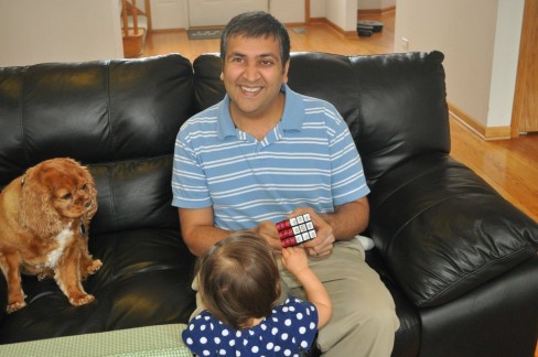

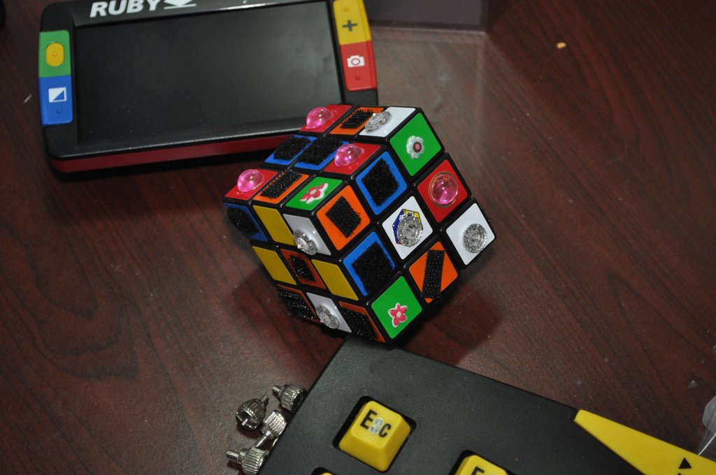
Missing the games that he used to enjoy, he recently modified a Rubik’s cube so that it could be played completely by feel. To me, this seems like it would make an already very difficult puzzle more challenging. As you can see that didn’t stop Sameer from solving it. He used velcro squares, plastic gems of differing shapes, and [I’m guessing] his daughter’s Dora the Explorer puffy stickers to tell the various sides / colors of the cube apart. He noted that the hooks and loops of velcro feel distinct, so he was able to use each of these textures for a different side of the cube.
This got me thinking about some recent electronic devices that I have been designing. I explained to Sameer that I have been working very hard to ensure that each of the buttons that I use can be differentiated by feel. I have noticed that I am often trying to work electronic devices in the dark and that it can be quite challenging depending on the attention paid to the tactile differentiation of the keys, etc. Sameer mentioned that the Nintendo SNES controller was a great example of tactile design, as its designers used both concave and convex buttons to great effect. He also suggested that I consider using differing textures on my buttons in addition to the other cues that I had considered such as differing materials, convexity vs. concavity, bumps of various sizes, etc.
I am embarrassed to admit that even though I am a rabid fan of noted interaction designer, Don Norman’s books [which discuss the tactile aspects of design], it hadn’t occurred to me that I was actually making these devices easier to use for the visually impaired. In seeing Sameer’s “Tactile Cube” I was reminded that the ways in which users modify objects to suit their needs can be a great source of insight into how to make products better.
What products that you have used are easy to use by feel alone? Can you think of any gadgets that are frustrating to use in the dark? Please post your responses in the comments below!
Sameer is currently running for Representative in the 82nd district of Illinois. You can find out details and volunteer here. Additional information about modifying the environment for the visually impaired can be found at VisionAware.org. I originally became aware of Sameer when he posted the pictures show here on Reddit.com.